Page 10 - Best Of Local Mag August 2023 Edition
P. 10
New City, New Ambition, Renewed Brand


       City of Moreton Bay has launched  “We are  dedicated to creating  a vibrant  “Which is why we have opted for a logo
       itself as Australia’s newest city with a  urban  experience  where  community,  refresh with a nod to the past, because
       refreshed brand and renewed ambition  economy, and environment flourish  we promised this would be a minimal cost
       to transform from a regional centre into  hand-in-hand.                  exercise.
       a national player.
                                           “But we recognise that we need to be more  “So all the colours and elements of our
       Residents could see the change on  forward-thinking than Councils have been  previous logo remain the same, we have
       Council’s website from Monday 24 July,  in the past, because we want to be a city  just modernised the design.”
       but physical signage will be transitioned  that is energetic, enthusiastic, and nimble
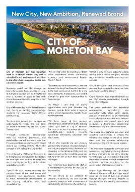
       over a number of years in line with  enough to grab new opportunities as  City of Moreton Bay’s logo still symbolises
       Council’s commitment to keep this a cost  they emerge.                   our city’s diverse communities through
       minimal exercise.                                                        three distinct layers:
                                           “As Mayor I am tired of seeing
       City of Moreton Bay Mayor Peter Flannery  opportunities walk past Moreton Bay  The green embodies our hinterland
       said  this  is  an  exciting  coming-of-age  because  people  think  we’re  a  regional  communities,  symbolising  our
       moment for Moreton Bay’s diverse  centre or not equipped to handle major  connection with nature, green spaces,
       communities.                        new investment.                      and our commitment to environmental
                                                                                sustainability. It represents the importance
       “As Australia’s newest city we have an  “We have some of the greatest  of preserving our natural assets and
       opportunity to rewrite the rule book  entrepreneurs and thinkers in the country  promoting a harmonious relationship
       on what a modern city can be,” Mayor  based  right here in  City of Moreton  between our city and the environment.
       Flannery said.                      Bay across sectors including advanced
                                           manufacturing,   medical   research, The orange layer signifies our urban and
       “Through   continued   collaboration agricultural  innovation,  education  and  coastline communities. It reflects the
       with our residents, businesses, and  much more.                          vibrancy and energy of our city’s urban
       stakeholders we will nurture a city that                                 areas and the dynamic relationship
       thrives on ambition and innovation based  “Of all SEQ Councils we are uniquely  between our city and its coastal regions.
       around our existing centres - that’s the  positioned to embrace new technological
       concept of our polycentric city model.  and industry opportunities, thanks to our  The blue wave represents our ocean and
                                           proximity to the Brisbane CBD, port and  waterways,  highlighting  the  significance
       “The philosophy of this transformation is  airport, as well as the incredible space and  of these elements in our city’s identity.
       to first preserve and invest in the lifestyle  natural amenities we have here that make  It symbolises our close relationship with
       we love right now, so that we don’t lose  us unique.                     the water, whether through recreational
       our character in the face of incredible                                  activities, maritime industries, or the
       population growth.                  “Our refreshed logo signifies the start of  preservation of marine ecosystems.
                                           a transformative journey for the City of
       “Specifically that means retaining the  Moreton Bay.                     Mayor Peter Flannery said the digital
       country charm of our rural towns and                                     rollout of the new title and logo would
       protecting  our  spectacular  coastline  “We are driven by our ambition to  occur at the end of July, but physical
       to foster sustainable development of  become a trailblazing city that balances  signage changes will only happen as
       new housing, industries, retail, and  economic progress with environmental  needed within the existing maintenance
       manufacturing.                      sustainability and community wellbeing.  budget.

